The Tangible Narration of Pooh
There are (at least) two things that the opening sequence and continued type-play throughout the original Winnie-The-Pooh series (between 1966-1974), contribute to make the show so great.

The first, is the originality of this style. Most motion-typography that came before the series would be difficult to deem as influential to this style, being either very simplistic or entirely different. Typically, cartoons only granted us either fading title-cards or static credits. Which means that Winnie-The-Pooh, in the still somewhat early days of animation was quite a maverick in the field of motion-typography.

Not only does the type move and change with environment, but it has a tangible effect on the characters in the story, themselves. Which brings us to the second reason that these sequences are so brilliant and engaging.
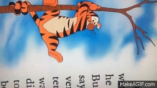
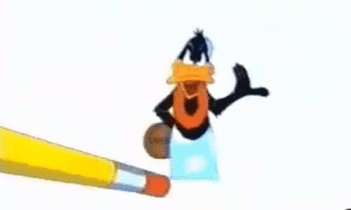
The type is given a secondary capacity for story-telling. Characters in Winnie-The-Pooh are able to read, hold on to, be struck by, and break through the very letters that tell their story. Pooh and Piglet and the whole Hundred-Acre-Wood are able interact with the narrator and his words in a deeper way than even Daffy Duck could before them.
 Meta-textual cleverness aside, this is a fantastic and singular (at its time) example of complete characterization and personification of type in animation. Type, in this case, plays a part. Tells another story that augments and divides the television from the original books while still playing the card of representing, and paying homage the printed words that made it all possible.

No one can deny that Winnie-The-Pooh is a delightful classic masterpiece of childhood animation and the show would not nearly be the same without the ground-breaking and significant character of type, that undoubtedly gave influence to much of the motion typography we see today.
