Vintage Store Signs – A Dying Art or Adaptation in the Digital Age?
(A piece dedicated to the hand-painted signages and retro design style in Vietnam during the 70s-80s in general, not to any particular artist or art piece)

Before everything is made out of a computer screen, the streets of Saigon, Vietnam used to be filled with hand-painted store signs. Hand-lettering/Calligraphy as a profession was far more popular back then, and ad billboards, store signs are among the commonly commissioned pieces for the artists. Each sign is individually and meticulously hand-painted with great patience, precision, and most importantly dedication from the artists, who would spend around 4-5 days to finish one sign from scratch.
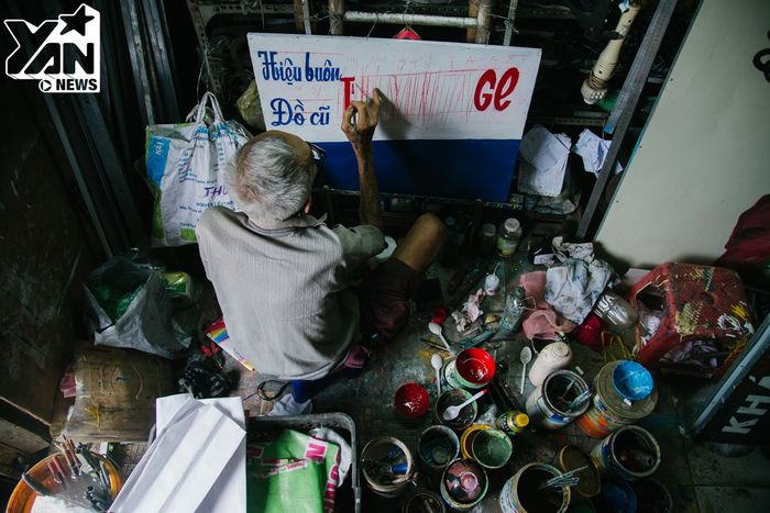
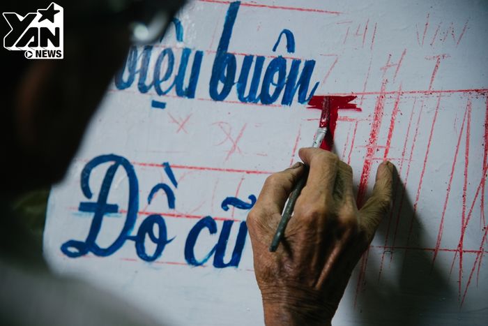
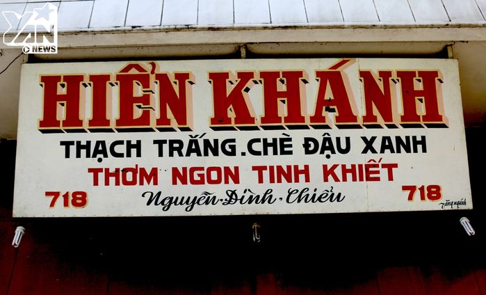
As I dig into Vietnamese vintage typography and design for the poster exercise, I fell in love with the retro/vintage style that appeared across the 70s and 80s of the country. This style can be told apart by a muted, slightly darkened color palette, and the typography that appeared across mediums back then (newspaper, stamps, signages, ad bill boards,…etc) are also uniquely recognizable and is very different from current typography practice: The letters are usually kerned and cropped very tightly, almost as if each word fit in its own invisible rectangular box; the primary text are usually drawn with a 3D effect for emphasis, and sometimes cursives are used for a more decorative feel.
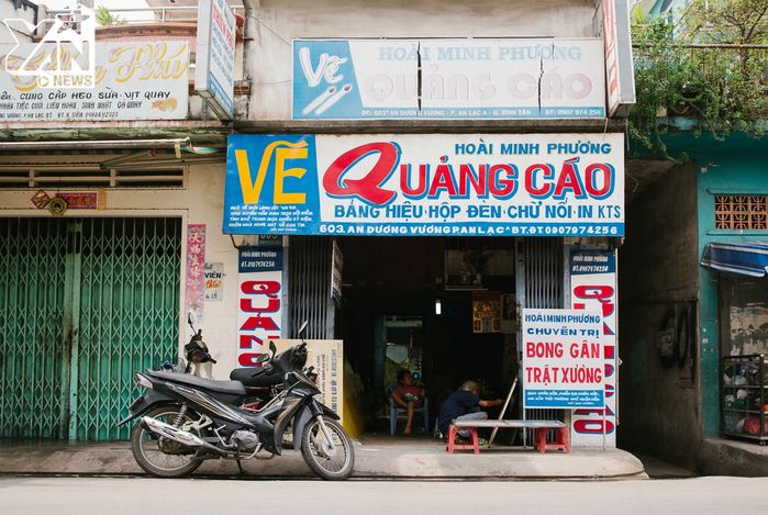
Unfortunately, as the digital age take over with vibrant neon signs and brightly-colored, computer-designed ads, this practice became a dying art, with only a few artists still practice the craft in today’s art scene. Yet, its retro aesthetics prevailed.
In Design & Advertising:
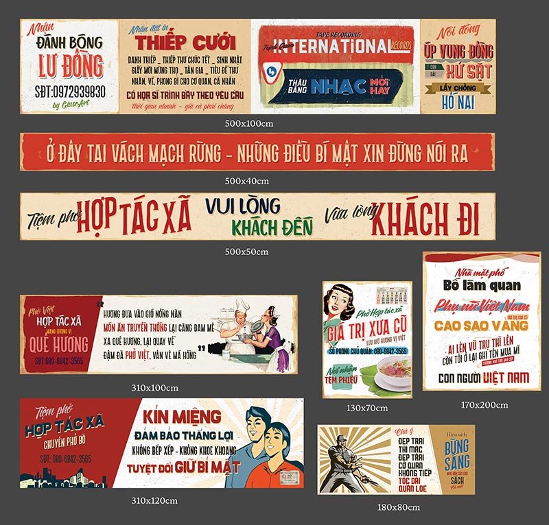
The retro theme is still widely recognized as a unique design concept among the creative community, and design pieces in this style are not uncommon, but most are now created digitally via Adobe programs instead of the classic hand-paint technique.
.jpg)
.jpg)
On the other hand, vintage-themed coffee shops are widely popular among Vietnamese youngsters – which helps maintaining the hand-drawn signs a somewhat relevant visual element on the urbanized streets littered with stone-cold apartments and skyscrapers.
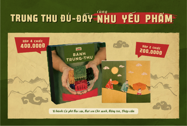
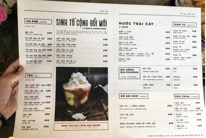
Cộng Cà Phê – one of the biggest coffee chain in Vietnam embraces the retro aesthetics into its branding. Everything from its communication design to interior design are styled perfectly to immerse visitors into a scene from the past:
In mainstream media:
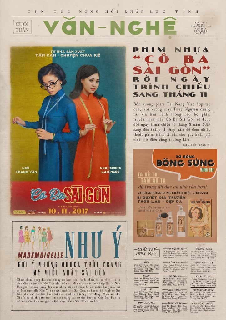
Mrs. Ba Sai Gon – A movie released in 2017 with the setting of Saigon in 1969 centered its identity around the retro style, with the signature typography and color palette appears consistently across their promotional and marketing materials: logo mark, posters, banners, social media posts,…etc
While hand-painted vintage signage might be a dying craft, its retro style has translated well into the digital age and continues to stay relevant in the design scene.

This is such a fun read! I absolutely adore the 70s and 80s so learning about this process is so interesting. It is so cool seeing all of the guidelines and planning they had to use to make everything perfect! Great job!